Hi all.
This blog is now an archive and will no longer be updated. You can find the new blog on my new site at www.marthahenson.com.
Hi all.
This blog is now an archive and will no longer be updated. You can find the new blog on my new site at www.marthahenson.com.
Posted in Uncategorized | Leave a Comment »
A little while ago I wrote this blog post on creating resources for teachers that they will actually find useful (summary below). It was partly based on research I carried out for Teach Your Monster to Read, a game from the Usborne Foundation for teachers and parents to help teach phonics to kids. Usborne wanted to know if there were other tools, games, videos or other content they could create that would make teachers’ jobs easier.
Very wisely, rather than guess at what these might be, they commissioned me to talk to teachers in the UK and US and find out more about how they teach the subject and what might help them. It was hugely instructive, we learned a lot about what teachers might and might not use, and the research results were used as the direct inspiration for a set of ideas that have now been turned into reality. Just launched on the TYMTR site are mini games, flashcards, videos and printable resources (teachers love to be able to print stuff and make it their own!). They are lovely things.

I know this user centred, research based design process isn’t new, but unfortunately in my experience people don’t always see the value, or ignore the research results when they don’t fit their preconceptions. For the teacher audience, who have very specific needs and little time, this is especially likely to result in a product that fails.
So, if you’re thinking of doing something similar, please read my previous post. The tl;dr version below:
Make life easy for teachers. They work hard, they don’t have much time or budget. Make it easy, and they are much more likely to use your resources.
And I would also add, test it heavily with teachers in the environment in which it will be used.
Posted in Uncategorized | Leave a Comment »
I used to give a talk about how museums should do more games. I would talk about how successful we’d been with this at Wellcome Collection with games like High Tea and Axon, and give other great examples from Tate, the Science Museum, the Smithsonian, and so on. However, I don’t feel that evangelising entirely makes sense any more, because the reality has proven tough.
So I have updated this talk to reflect that reality, to look into why some museums have found it actually very hard to create successful games, and to suggest a solution. Below is a video of me giving it at We Are Museums in Bucharest earlier in the year, including a short example of live game design game Cat On Yer Head in action. Since the slides from that are quite hard to make out, I’ve put them below, along with a summary.
Since the talk, I’ve left Frankly Green + Webb to go solo again, with a view to focus more on the game side of things (along with some general digital consultancy and research, and, er, yoga teaching and other bits and bobs. I do like a portfolio/random sort of career!). One of the things I offer is a game design workshop, which has proven very successful (two comments from the last one I ran: “I was really impressed by the way we managed to create our own games at the end of the session – this was really inspiring.”,”I’d say you learn a lot while having lots of fun. Great if you want to understand more about how games work and become a better commissioner of games.”).
The workshop gives you a chance to try out the principles described in the talk below, and feel confident about what it takes to create a good game. I’m looking for various outlets to run it at the moment for whoever wants to come, so more on that soon, but I have run it for specific organisations in the past, tailoring it to their needs, so if that sounds like something your museum or group would be interested in, let me know (give me a shout via twitter or linkedin). I genuinely love doing this workshop, it involves a lot of play and experimentation, and at the end of it participants have come up with some properly brilliant ideas.
On with the talk:
And the written version:
I’ve simplified, and generalised here, of course. Some game designers take different approaches in their work, which is fine. But this post isn’t for experienced game designers, and you can always break these rules once you’re comfortable.
I would also now add: be clear about your limitations e.g. if you don’t have sufficient budget to do a good digital game, don’t do a bad one on a small budget. Would a physical or board game work instead? (And sometimes, of course, a game isn’t the right approach at all, but you have to understand them to make a good decision about that).
I hope this is useful! Go make games 🙂
Posted in Museums, Thoughts about games | Tagged design, games, museum games | 1 Comment »
Woo, on to the bandwagon I go, roll up for my hot take… (And a links round up, which you can skip to the bottom for if you like).
SO I tweeted this earlier today
I was kidding, but it turned out I was already too late, as people messaged me to say they had already heard this happening.
Listen, the massive success of Pokémon Go is very interesting, no doubt. I’m enjoying playing it, and that’s despite the fact that the collecting/battle game mechanics themselves are not even that compelling. It’s just fun seeing pokémon out in the real world and the surprise of finding them, the collecting and evolving and sharing the pictures and so on is enjoyable too, plus I found out about several local landmarks I hadn’t noticed before, bonus.
And yes, the collecting is obviously something museums can relate to, museums love collecting based games. However, museums are not Pokémon, they do not have objects as beloved as Pikachu (sorry), they do not have the staggering reach and influence and years of brand development that Pokémon has, and they do not have the budgets, not even close. Amongst other things (Dan Hon’s post on how to replicate Pokémon Go’s overnight success explains this excellently, thanks to Chad Weinard for pointing me at that). And believe me, I’ve tried something in this vein. I still love Magic in Modern London but getting traction on something like that was insanely difficult.
My original tweet was in response to this, which sums it up:
I’ve been in countless discussions with people at cultural organisations who point at similarly huge success stories (“we’re thinking maybe we could do something like Clash of Clans?”) and want a piece of it. I understand why, but Clash of Clans is no overnight success either. Making games of that complexity takes serious time, expertise and budget. I’m a big advocate for museums doing games, but they need to be different beasts: simpler, and more focussed. (Not convinced? Hire me to run my game design workshop in your organisation and you’ll have created something like this by the end of the day).
It is good, however, to see museums embracing Pokémon Go itself and getting excited about it. It has already driven up attendance at some museums. So here’s my round up of the interesting stuff I’ve seen so far on it:
Seen anything else? Share it in the comments.
Posted in Uncategorized | 2 Comments »
I was recently evangelising about using Trello to keep on top of everything to someone, which involved trying to describe how I use it. It was a bit difficult, in the abstract. So I decided to create a template board that mimics the way I use it, in the hope that it might also be useful to others.
Quite genuinely, it has made my life a LOT easier. I no longer forget stuff when packing for trips, I rarely miss exhibitions I want to see, I can see what I need to shop for when I find myself in the supermarket, I can see what I need to save money for (and don’t forget who I owe money to), I can easily see my slate of activities for work, and quickly put a to do list together for the day. When I am at a loose end at home, I can check my list of jobs around the house and clear something off the list. Very satisfying. And a huge weight off of my brainspace.
For example, I’ve had “write a blog post about Trello” on the list for a few days, and now I get to check it off (or rather, archive it, the Trello equivalent).
It is SUPER easy to use, as long as you have an internet connection. It syncs across my browser and phone, so I always have my lists handy. I haven’t tried calendar integration yet, but will explore that soon. Because it genuinely integrates with my life and makes things easier, it has stuck, and I’ve been using it for a few years now. (It’s a real art, creating processes and tools that actually stick).

Work/Life trello template
Here is my template. Hopefully it’s pretty self explanatory. I’ve put some descriptions in for certain cards. But basically when I think of any new job (or thing I want to see or do, or shopping item I’ve run out of) I create a new card or add it to one of the lists. Then, each day first thing I move cards to “today” that I need to get through or that I could reasonably tackle. Some cards might not get moved to today, but are useful references in different circumstances.
I’ve also used Trello on work projects to share tasks with other people, but this is the board I use the most.
I’d love to hear any other tips that people have, or comments on this. Was it useful? Do you do something differently?
Posted in Uncategorized | Tagged organisation, project management, trello | 2 Comments »
This is going to be a rant, because I’m cross, so, fair warning. First I’m going to tell an illustrative story, and then I’m going to make the case that a really large proportion of digital projects are TOTALLY WASTING THEIR TIME AND MONEY. Here goes.
In my pre-museum days, before I joined the Wellcome Trust, I worked on digital projects for TV at Kudos for the best part of 2007. You may or may not recall an ITV show from the following year with an interesting concept: it was a rather cheesy soap opera set in Cornwall with Jason Donovan and Martine McCutcheon called Echo Beach, which was followed in the schedules by a fictional comedy about the making of Echo Beach, called Moving Wallpaper and starring Ben Miller. The whole thing was the brainchild of the great Eastenders lead writer Tony Jordan.
Alongside the main show a third online element had been commissioned, which is what I was working on. I still really like the idea, which was that a mole was operating on set, filming secret behind the scenes footage on Echo Beach. Before the TV show launched, and each week during it, these videos would be “leaked” into the public domain, showing the stars behaving badly, being divas and drunks, riffing off of their public personas and TV characters.
The aim was comedy and shock. A crack team of writers (from the Thick of It and other notable shows) was assembled to write the video skits, of which there were 12. An experienced comedy director was brought on board, and a small team of top filmmaking pros assembled. We got Jason Donovan (an absolute hoot to work with) supposedly filmed alone in his dressing room putting on a dress that Martine McCutcheon had worn on the show to mime along to her Perfect Moment hit. We also filmed him involved in vodka fueled fist fighting and fights with his agent, McCutcheon herself having tabloid-baiting practice snogs with female co-stars, secret thieving, incompetence, actors being ridiculously demanding and all sorts.
It’s been a long time since I’ve seen any of those clips, but I seem to remember we were all pretty proud of them when we handed them over to ITV. And either way, a lot of effort and talent and a not insubstantial (albeit not quite sufficient, it never is) budget went into making them. Which made ITV’s subsequent bungling of the next stage all the more galling.
Our concept was that these videos would be released to a poorly executed website (Geocities style) by the “mole” and then the press and public would be pointed at them. These days, they would be leaked to YouTube from the mole’s account, ideally, but the main thing was to maintain the fiction that Moving Wallpaper was the real world and the behaviour captured was genuine, and thereby preserve the joke. Instead, ITV did this: they created a page on the official ITV site for the videos, using the official ITV player to play them, and then they used the punchline as the title for every single video, giving away the gag before anyone had even started watching them.
The jokes were thereby rendered stone cold dead.
They then sent out, as far as I can tell, one press release which sparked two small articles from the Sun and “Celebs Now”, and that was the extent of the marketing effort. I haven’t seen the viewing stats, but I’m 100% certain they were feeble. And that was the end of that project. All that hard work, months of preparation, script writing, production and editing. All that money, pretty much entirely wasted by a failure to understanding digital marketing, and a failure to invest any serious time and effort in promotion.
I wish I could say that was the last time I saw this happen.
I’m using this example because it’s far enough in the past that I can be brutally honest about it, but it stands in for probably a good 60-70% of digital projects I’ve worked on, to some degree. This includes projects for museums and galleries, for publishers, and for other broadcasters. It includes my projects and the projects of others: I did a straw poll amongst other digital producers, and my goodness! The outpouring of anguish and recognition that followed.
And I’m writing this now because despite all my best efforts, I recently watched exactly the same thing happen again, and I’m fed up. I want to say this:
Stop wasting money on digital projects if you aren’t prepared to promote them properly.
I’m serious. Do NOT embark on any digital project if you aren’t going to at least make a decent effort to tell people about it or otherwise figure out how people are going to see it.
If you are going to make an in-gallery app but only have room for a small piece of signage and no budget or space for print promotion, do not bother. If you are going to create a game and put it on your website and think maybe your organisation might be able to muster up a single tweet and facebook post about it, give up now. If you are creating an amazing interactive video experience but the entire budget is going on production and you’ve run out of money to market it, stop.
Furthermore, if you think that a digital experience, be it mobile or online, game, video, or guide, is going to sell itself, and thereby itself be marketing for your TV show or exhibition, you are going to be sorely disappointed. Actually, I suspect this attitude is partly to blame for some of the failures in this area. There seems to be some confusion over whether these digital add-ons are marketing themselves but, by and large, it doesn’t work this way, things just don’t magically “go viral”.
Now, I have been part of some very successful game projects in which we did pretty much no marketing whatsoever (High Tea and Axon, for Wellcome Collection). However, we were working to a very specific distribution model that relies on making a cracking game, seeding it to casual gaming portals, making it easy to rip and waiting for it to catch on. It worked, the mechanics of those portals make this possible, but it has its flaws (not least reaching a relatively narrow demographic).
For mobile games, in gallery apps, online interactive fiction etc etc, this is not an option. You are competing in a very crowded market for audience attention. Even if your content is amazing, you are going to have to work very hard to make people aware of it, and do so in a way that sells it effectively to draw them in. Let me be clear: I’m not saying this is easy, and it can involve a bit of luck (the right person picking it up on twitter, for example), but it cannot just be ignored.
So why is it, so often? Apart from the reason above, I feel like a major factor is that these digital projects *are* just seen as add-ons. They get neglected by marketing teams who are focussed on promoting the big exhibition or show, which is where the real accountability lies for their actions with the higher-ups (and the funders too, perhaps?). I’ve been there in meetings with comms teams who make it clear that our digital project is just never going to be a priority when they are being scrutinised instead for their role in increasing actual ticket sales or getting press for the main exhibition.
If that’s the case, the project probably shouldn’t even go ahead. Whatever the size or type of audience you are seeking, someone absolutely has to make some sort of plan and put time and resource into communicating with them. So often this seems to fall to the production team themselves in this situation, but without organisational buy in, this is never going to be as effective as it needs to be.
For my own part, I try to have a discussion about communications around a digital project as early as possible once it’s kicked off, but I’m beginning to realise that this is too late. These conversations need to happen before, and at a higher level. There needs to be a commitment before any major work starts that the project will be fully supported by the organisation.
It’s also clear that some comms and marketing teams feel out of their depth with digital projects. Some of this is a problem of perception: digital projects can be promoted in precisely the same way as books and exhibitions – with signage, adverts, flyers, social media posts, targeted press releases, building relationships with bloggers and newspapers and so on – and the principles about what makes an appealing message are not necessarily different.
I fear the problem is more about understanding the digital product and its potential audience, and therefore knowing *who* to build relationships with and where to send a press release. But surely, this is no different than looking for subject specialist avenues to market to for other products? Also, there are various online-only routes (your Reddits and the like) that comms departments seem wary of but need to understand. It’s not hard, you do it by using these sites and getting to know them. If this is all too much, hire a digital marketing agency to take the weight.
Aside from the wasted time and money (sometimes public money too, which is particularly infuriating), what I find very dispiriting is organisations using the failure of digital projects as a reason to stop doing them; writing them off as inherently risky instead of examining what went wrong and trying to learn from mistakes. It’s also dispiriting to see the level of frustration from digital producers and agencies, many of whom have told me that they are avoiding work of this kind from now on because they are sick of seeing it fail due to a lack of promotion. It was part of the reason I started moving away from digital production work too.
Of course, it’s possible that some of these projects were just rubbish, that the content or concept was just unappealing. But it’s really clear that users and viewers aren’t even getting to the point of finding that out and these digital projects aren’t really being given a chance.
I don’t think it’s that complicated: projects of this nature just need the budget, commitment and a plan as to how people are going to hear about it. If this isn’t in place from the beginning, ask why, and don’t start until it is.
Whilst writing this I heard so many stories of this happening, but few that people were willing to put names to (although blimey but the BBC comes up a lot, Channel 4 too). I understand. But if you have an example, even if just anonymously, please do share in the comments. Or have you got any other thoughts on this, do you disagree?
Posted in Digital strategy | Tagged broadcasters, digital, museums, promotion, publishers | 20 Comments »
This follows Part One of DC/NYC: an epic museum tour which talked about my visits to the National Cryptologic Museum, The Renwick Gallery and the National Museum of Natural History (featuring instagram uses in a museum, a great use of augmented reality and brilliant docents) and Part Two in New York, with visits to the Cooper Hewitt, Met MediaLab and the American Museum of Natural History (robots! games! the Pen!). This is the final post (I promise).

more mini golf in museums pls
On Friday I dragged my family in a post Thanksgiving blow-out haze to the New York Hall of Science at Corona Park in Queens. I don’t think they were pleased about the hour long journey from Brooklyn, but ended up having fun playing with all the hands-on exhibits about various aspects of science. I LOVED their demonstration of cosmic rays zipping through a cloud chamber before your eyes. And I also loved the idea of science themed mini golf. The interactives may not all be the most technologically advanced, but they got you involved, and genuinely helped you understand things.

Learning about Cosmic Rays
The main reason for going there, though, was to see the Connected Worlds game/installation about keeping an ecosystem in balance. If you are picturing something on a screen, or even a touchtable, think again. This is COLOSSAL. See the picture below. It has two vast screens around a central circular area. Between the screens is a tall screen depicting a waterfall, which then runs as a stream across the floor. Players can interact with what’s happening on the screen by making hand gestures, or moving logs around on the floor which translates into planting seeds to grow plants and move the water to where it needs to be. It appeared to get more advanced as the game, played in half hour sessions, goes on (I didn’t get a go, we didn’t have time to wait).

Getting briefed at Connected Worlds
It is absolutely spectacular, make no mistake. Visitors, nearly all of whom appeared to be family groups with young kids when I was there, seemed to pick it up easily and were clearly absorbed by the interactions. It is like nothing else I have seen in a museum before, I don’t think. It’s really beautiful, and seems to work, technically, very well. The only dampener was my slight suspicion that visitors weren’t necessarily getting the most possible out of the experience. It’s meant to be about keeping the world in balance, yet I didn’t see people outside of family groups working together much.
I also didn’t get the sense that people were getting the nuances of what was happening, or making informed decisions (rather than just playing around), and given the young age of many participants, fair enough perhaps. However, I wondered if more hands on facilitation and scaffolding of the experience might make it even more powerful. For example, pointing out things that were happening to the whole group, or setting shorter term goals, adding drama, turning it into a story, etc.
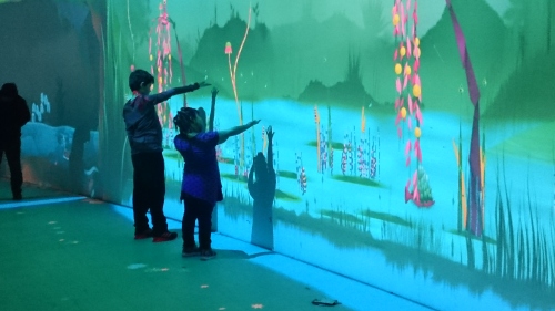
Visitors playing with Connected Worlds
To be fair, I was an outside observer, and only watched one round, so maybe that does happen at other times, or maybe I just wasn’t picking up on it. In this BoingBoing article Zack Gage, who consulted on the app , does say “My biggest pushes were for ensuring that the takeaways for children were experiential (to be unpacked later with educators/family members/friends) rather than a set of point-by-point facts or statistics” which I am very much down with in general.
However, it does sometimes feel like museums assume all digital should just stand alone as an experience, when it can actually really benefit from good facilitation and a bit of direction.
I’m almost there! We paid a visit to the fabulous Morbid Anatomy museum, with its current wax work exhibition and nice cafe and shop full of things to covet (taxidermy I wished I could afford, or have a house big enough for). And then, finally, on my last day, we went to the Brooklyn Museum. It’s a great collection, with really good interpretation, I thought. Very accessible, very clear. It’s currently running a lovely show on Coney Island, definitely worth going to see.

The ASK app in action
The work related reason for going was the ASK app, which allows you to ask questions of curators in real time. What a great idea, I’d thought, will it work? It did, with the patient Elizabeth answering my questions about the museum, its patrons, things I couldn’t find, and the collections itself. The answers were rapid, and pitched at a useful level, including links out to other resources. My family got in the habit of coming up to me to fire off questions for the app, and definitely benefited from having this helpful resource.
It is super simple to use, fitting the maxim that a good app should do one thing well. I just wish it saved the answers so I could still see them, as it seems to have removed the content now I’m out of the building.
The team have been blogging the development experience on the Brooklyn Museum website, and it’s well worth a read.
So, that was my East Coast USA #musetech experience. If you got this far, thank you for reading, I hope it was useful. Clearly, I still managed to miss many hundreds of other museums in those two cities (including the Tenement Museum in NYC, which people kept telling me about, and the Newseum in DC, which was also recommended for its use of interactives).
I guess I’ll just have to go back.
Posted in Museums | 1 Comment »
This follows Part One of DC/NYC: an epic museum tour which talked about my visits to the National Cryptologic Museum, The Renwick Gallery and the National Museum of Natural History (featuring instagram uses in a museum, a great use of augmented reality and brilliant docents). (Part Three, the final part, on the New York Hall of Science and Brooklyn Museum, now live).
By Tuesday 24th November I had moved on to New York, staying in Brooklyn with family. Since my Frankly, Green + Webb colleague Laura was staying not far from New York, she and I took the chance to meet and spend the day visiting the Cooper Hewitt (the Smithsonian Design Museum) and trying out their Pen and other interactives, and then on to see the Met’s MediaLab. The next day I went to take a look around the American Museum of Natural History.
So first to the very grand environs of the Cooper Hewitt museum, previously the Carnegie Mansion, to try out the Pen we had heard so much about (and see the collection, of course). In case you’ve missed all the discussion about it, it’s a tool to encourage visitors to be more active in the space, collecting and saving objects to view later. In some ways I guess it formalises the existing visitor habit of collecting objects by photographing them and takes it a few steps further.

Using the Pen to design a very impractical table
The pen itself is very nice to use, chunky but comfortable, simple to operate. It works as a large stylus at one end, and has a collecting tool at the other which you can use on object labels (with an RFID chip in them) to add them to your collection. There are large interactive tables throughout the galleries that feature a design tool (make your own chair, building, or thing), ways of browsing the collection (object pictures drift past like sushi on a conveyor belt and you can grab them to get more details, or search via related tags), and ways of pulling up what you have collected so far. After the visit you can also see your collection on the website.

Using full body gestures to browse the collection
The staff are there to give some orientation, one of whom gave us an extra steer in using the design tool that was really helpful. I enjoyed playing with this feature (but wasn’t quite sure where to go with it once I’d messed around with it a bit, I wonder how this could be extended?). Laura and I both spend quite some time browsing objects on the big table, it’s a nice way of just seeing what grabs you and following that down a rabbit hole. You can also browse the collection by just drawing a shape, which then searches for something else with the same shape (elsewhere you can also do this on a big screen with gestures – see pic). A nice playful interaction.
It didn’t occur to me whilst there to collect objects in the cases to look up more information on them whilst there. This would probably have been useful at the time to answer questions I had about some objects. I wonder if there are ways to get at more interpretation by doing that, e.g. a glossary of terms or something. It feels like there is potential to do even more with the pen, so am keen to see how that develops.
For me, the standout was the Immersion Room, which was an experience I could have spend hours in, probably. It is linked to the wallpaper collection, something I have a particular interest in anyway, and allows you project designs from the collection up onto the wall, browse around related designs and listen to experts talking about them. Rather brilliantly, you can also design your own, which is then tiled and projected on to the wall. I made a rather slapdash effort, so being immersed in that was possibly a bit of a trial for everyone else in the room, but I bet some visitors have done some really beautiful things for it (and no doubt, some very crude things, but you can’t stop human nature). My post-visit collection from the Cooper Hewitt is here.

Immersed in wallpaper

3D printing in the MediaLab
In the afternoon we went to meet Elena Villaespesa, who used to work with me at Tate doing clever things with analytics, and is now Digital Media Analyst at the Met. We also met Marco Castro Cosio, head of the MediaLab, who gave us a tour. They have all the fun toys – a robotic arm, telepresence robot (which has been used at some events, I think they said, so that people can attend at a distance), a 3D printer (which had been used to recreate a museum object in sugar, though no-one had had a nibble yet) and were also doing some nice stuff with projection mapping to show the true colours of an Egyptian tomb. Thank you to Marco and Elena for showing us around!
Will definitely be keeping an eye on the Met MediaLab blog in future. Apparently they are not alone, Labs seem to be quite the thing these days (h/t Lindsey).
The next day I met Barry Joseph, Associate Director for Digital Learning at the American Museum of Natural History (or AMNH). I was particularly keen to hear about their work with games, and loved the fact that they had been working on card games such as this one, Gutsy. Card games and the like could be such a perfect fit for so many museums, and you can sell them in the shop, they make a nice gift. Win/win. Anyway, Barry gave me a tour of their new Microrangers game , an impressive piece of tech that combines AR, minigams and a kind of treasurehunt around the gallery. It just launched officially this week.
He too has a telepresence robot, and kindly gave me a demo. They had used it to bring voices into the gallery, e.g. Canadian First Nation curators based elsewhere being able to interact with visitors. Tate has done the After Dark project with similar robots, but has anyone else in the UK? I like the potential, and the way that both the Met and AMNH were using them. Very interesting, thank you to Barry for taking the time to meet!

Octopus from Opulent Oceans. So lovely
Also at AMNH was the very shiny and interactive Secret World Inside You, and the utterly gorgeous little Opulent Oceans exhibit of sea life themed artwork. From my twitter page, you might guess that I’m already in love with Ernst Haeckel’s work, so I was very excited to find so many other artists who had done beautiful work in this area. The latter is also collected in this book and ah, it’s Christmas coming up. So, you know…
(Part Three now live, with visits to see Connected Worlds at the New York Hall of Science and Ask at the Brooklyn Museum)
Posted in Museums | 2 Comments »
I came back this week from 10 days in the States where I visiting my brother and sister-in-law, who recently moved to Brooklyn, with my parents for Thanksgiving. By pure coincidence, my Frankly, Green + Webb colleague Laura was also on the East Coast of the US at the same time visiting family. I took the chance to see a ton of museums (ten! in total), meet up with Laura, and also meet some interesting museum folk working in digital.
Ten is a lot of museums to cover, so I’ve split the posts up. Here are my experiences in Washington DC at the National Cryptologic Museum, The Renwick Gallery and the National Museum of Natural History. It was my first trip to Washington and my goodness, it doesn’t do its museums and monuments by halves (they are all SO BIG, and the Mall? Almost overwhelming).
The first museum trip was out of D.C. a bit, to the NSA’s Cryptologic Museum, a quirky history of code-breaking next door to the NSA’s site about 45 minutes drive from the centre of D.C. The museum itself has a few recent additions to bring some of the tech and the story of cryptology up to date a little, but most of it doesn’t appear to have been changed for quite some time. It could have therefore been quite dry, especially with such a complex subject matter, but their greatest assets are their brilliant docents, who bring the objects to life.

A not great picture of our Cryptologic Museum docent next to a code breaking machine
We first met the docent who would become our guide at the Enigma machine, where he was showing us how to use it (they had one that was available for visitors to play with). It was the first of many experiences at the museum where I was suddenly able to understand the purpose and function of a complex object that I’ve previously struggled to grasp. This is something that digital interactives can sometimes help with, but to be honest, I’m not sure can make up for the human touch and the ability to respond to the audience in person and answer questions. Our group was hooked, and we followed our guide around the rest of the museum as he told us fascinating stories about Pearl Harbor, the Battle of Midway and the Cold War.
I learnt so much, and must admit that by the end of it I was left wondering whether more museums should concentrate their efforts on hiring as many knowledgeable and passionate docents as possible and worry less about text (or digital) interpretation. With the best will in the world, consuming information visually, by reading especially, becomes tiring and difficult before too long in a museum. But when you have an engaging human being telling you stories, well, it somehow becomes very easy to take it in.

Wondering and instagramming in the Renwick Gallery
On to the recently re-opened Renwick Gallery, for their fantastic Wonder exhibition of large scale art installations by nine very different artists. It’s all very photogenic, clearly something recognised by the museum who encourage photography by suggesting a hashtag and featuring a screen with an instagram feed showing visitor’s pictures. This meant that the frequently seen visitor behaviour of photographing objects and artworks was in overdrive. I was unable to stop myself too. It didn’t leave much room for quiet contemplation, but I don’t know if these pieces necessarily lent themselves to that anyway. I think that’s OK, we thoroughly enjoyed it. Thanks to Brian Alpert for recommending this via twitter.
Next day, onto the Mall for the National Museum of Natural History (and a flying visit through the National Gallery of Art, a very grand space). The NMNH had been high up on my list to visit. Not just because I am a fan of natural history museums (the dustier and wonkier the better, IMHO) but because I’d heard Diana Marques speak about an upcoming app she was working on for them at EVA in 2013, and was intrigued. The app is Skin and Bones, and is now live. Laura and I both tried it out in separate visits.
The app was created in response to the fact that visitors can find it hard to engage with the skeletons in NMNH’s Bone Hall, since they don’t know how to interpret what they are looking at. Skin and Bones uses augmented reality (AR) to overlay animal bodies onto the skeletons or to animate them and show how they work. My highlight was the animated overlay showing how the woodpecker’s skull allows it to have a very long tongue that wraps around its brain. It’s a really really neat use of AR, appropriately used and well implemented. The only downside was that it was so great it made you want to see this for any animal in the Hall, but it’s only available for the few of the skeletons. Hopefully they’ll add more in the future, I imagine it takes a lot of work to create these.

Very cool Woodpecker animation
Some other thoughts. The AR does somewhat overshadow the rest of the content, which involves activities and videos. I wonder whether people actually do those, when the AR stuff is so enticing. Also, neither Laura nor I had brought headphones, and if you don’t have headphones with you, or are sharing the device with others, you’ll need to play the audio out loud. From previous experience, many visitors are uncomfortable with this, which is why some places provide headphones, or loan out devices so that groups can have more than one (and so the experience doesn’t rely on people bringing their own, of course). I understand some visitor evaluation is forthcoming in the next year, am really keen to see it and see how it’s being used, I think it will be very interesting for anyone thinking of doing something similar.
Whilst there was a lot of signage for the app in the room, we didn’t see anyone else using Skin and Bones, or any signage for it in the rest of the Museum (though perhaps we just didn’t spot it), which seems a shame. Maybe it could be more heavily trailed elsewhere and in general marketing so that people come prepared and excited about it? Laura tried it with her kids and they also really liked it (and wanted more) so it’s a great asset, worth shouting about. If you have the chance, go check it out.
(Link to Part Two: NYC, robots, the Cooper Hewitt Pen, games)
Posted in Museums | 3 Comments »
Game type cards from previous workshops
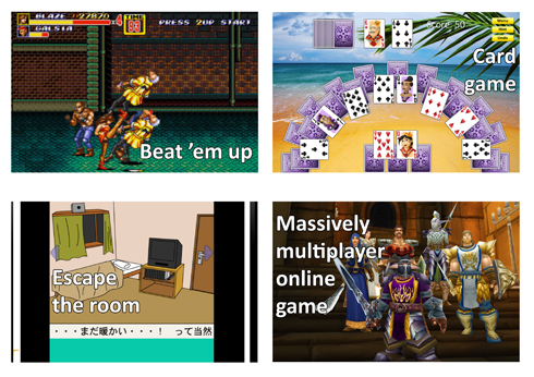
I’m writing this to share a simple tool I created for a gaming workshop I recently ran for a museum, and also to see if anyone has suggestions for additions or improvements to it. It was inspired by another card-based tool that Danny Birchall and I created for games workshops a while back, found here. That one was designed to help people rapidly generate game ideas around a particular (museum related) subject. It was a stack of cards with a game type printed on one side and the description (generally from Wikipedia) printed on the other. I’ve used them a lot in classes and workshops since, they work well. You’re very welcome to download and use them yourself.
For the recent workshop, I was tasked with helping a room of non game designers understand the possibilities of games, and a bit more about the process behind their creation. We talked about game design, played a load of mobile games (mostly from this list of local multiplayer games) and discussed the mechanics, and then split into teams to generate game ideas, pick a favourite, create a paper prototype, play the other team’s games and feedback on it. We had about an hour and a quarter for the idea and prototyping session.
My overall aim was to focus the participants on thinking about game mechanics (rather than story etc), the effect they have on the player, and how they can be married to the intended learning or behavioural objectives. Given the limited time, I needed a way to give each team inspiration and an easy reference point for possible existing game mechanics rather than expecting them to pull them out of thin air with no experience.
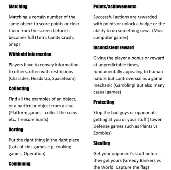
Game mechanics cards selection
So I created a set of game mechanics cards with the mechanic, a description, and a couple of hopefully easily recognisable examples. I gave each team a set and encouraged them to use the cards to inspire ideas. It seemed to work pretty well, with a bit of facilitation. I’ve linked to them here on Google Drive, I hope this works, let me know if you are trying to access them and it doesn’t work. The idea is you cut each one out onto its own card (a job for which I wish I’d had a guillotine).
Please feel free to take these and use them any way you like. If you repost them, it would be nice if you could link back here. It would also be nice if they could be expanded and improved. I’m sure there are lots of mechanics I’ve missed or better examples I could have used. Any suggestions for more mechanics to add? Please add comments below or send to me via twitter if easier. Thanks!
At some point I will go back in and tart them up a bit, they aren’t as pretty as the other cards, at which point I will add in suggestions and will also share them here.
Posted in Museums, Thoughts about games | Tagged educational games, games, tools, workshops | 2 Comments »


